


WimDem
-
Content Count
23 -
Joined
-
Last visited
Posts posted by WimDem
-
-
The only program you should be using for making logos: illustrator, if you make a logo with photoshop you might want to scratch behind your ears haha
-
I see what you did there you dirty little cheater ;D

No but it still looks cool though;)
-
alright how about this one ;D
Hey i like that.
Maybe a bit tall though. Would look fantastic as a sports team crest on a shirt, but might look odd on a website header.
How about you minimise the black and white stripes, squash them up to the top?
My favorite so far though. Maybe i'll have a crack at one tonight.

The one on the left for on merch/posters/ts banner/etc the one on the right for websiteheader
-
alright how about this one ;D
-
My idea behind this was that a logo mostly represents the name of something and in game communitys mostly not so much what they do that was the idea.
-
-
-
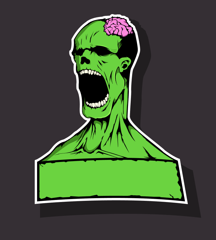
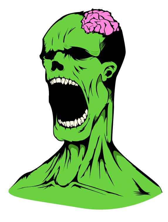
Alright I hope you guys are ready to give me a mousemat because im gonna be a nice guy and make you a logo I got a great idea and it has a kick ass zombie, main colors will be dark green colors tho so deal with it :D im gonna start on it today so you can expect it somewhere this week ill just post the progress on this forum all thanks to gunstar for whining a couple of times .
#reviving dead topics.
Ps dont worry guys this logo will be sick and if you guys eventually dont want it dw ill just sell the concept. Get ready to be dazzled with sparkles and unicorns and like brains and stuff rainbows. So yeah akward..
-
hi im back :D


-
i really wouldnt know how to
-
ooh I dont think there will be any problem with my logo on it honostly because no matter how far i shrink it down the design stays visible, tho the letters might become too small on it but i dont know
-

The design it made on it that it can be sized down really easily without that much of a quality loss they look the same but the top one is 2000x2000 and the bottom one is 556x556

even at 200x200 the image is still pretty fine

But i srsly wouldnt do my logo without the OB

 Biggles' one works -much- better for skins in server, imo. It's simple
what do you mean with skins in the server ?
-
god damnit i thought those bolts were cool :c
-

and i thought what if i remove the inside so the outside is like a O aswell (the letter) and the inside really is a jail

The part behind the bars and the letters is transparant
-
Might I suggest perhaps changing the inner "light grey" circle into a O from and not a circle so like a bit strechted from top to bottom.And the outer line which is completely black and has "light" effects on it. I personally feel like it would be nicer without them edges or atleast smaller.
I tried the O figureinstead of a circle but it makes it look really weird tho i can change the outer line to a bit smaller:

(with the o figure)

-
-
this is with round insides

or

-
i quite like that one windem :Dreminds me of the old one
that was what i was going for haha
-
so there were different oppinions on what i first posted here ( with moslty from me a misconception about your current logo) so I thought it over and made a second try more focused on the "old" logo and the meaning of the logo

any oppinions ?
-
then why if you got a good logo do you have I quote this ran over rugby ball as front page logo :O ?
-
Hi Im wimdem from the LR community , im the graphics desginer there and i saw your logo and imo its kinda ugly .... so i thought what the hell i dont have anything to do anyway so


anyway you can do with it what you want, if you dont like it then just ignore it :P
-
Hi I'm WimDem aswell a member of LR and ofcourse i know freekilling ruins everyones fun on jailbreak servers, I want you guys to see the other end of the story aswell. The rules seem to differ a lot between our servers ( I know since i was there yesterday aswell ) and I can't believe Jackz would purposely freekill people. I was warden yesterday on your server and the rules just seem to be a lot different. ( i didnt shoot anyone because they told me afk freeze wasnt a command apparently ) But i seriously doubt Jackz would purposely freekill anyone please keep this in mind considering your punishments.

Outbreak Logo Contest [Prize: OB Mousepad + 2000 Creds]
in General Chat
Posted
Oh I actually wanted to point out, but for got, that the most of your shapes in the logo are weird and unproportionate just look at the White Windows, thats just an example but you really need to take a good look at the entire picture since a lot of shapes dont really make sense haha